How to Read a Candlestick Chart: Beginner’s Guide

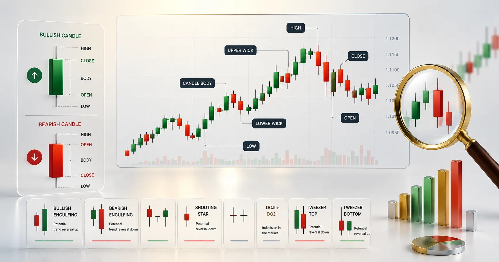
- A candlestick shows the open, high, low, and close, or OHLC, for one time period, the same data as a bar chart, just displayed more intuitively
- Color tells direction: green/white means the close was higher than the open, bullish; red/black means the close was lower than the open, bearish
- The body shows the range between open and close; the wicks, or shadows, show the highest and lowest prices reached during the period
- A long wick with a small body signals rejection, price tried to move further in one direction but was pushed back before the close
- Candlestick patterns are generally more reliable on the 1-hour timeframe and higher, since shorter timeframes carry more noise relative to genuine signal
- Single candles, doji, hammer, and multi-candle formations, engulfing, head and shoulders, both carry meaning, but combinations are generally considered stronger signals than any single candle alone
- No candlestick pattern guarantees a specific outcome; reading charts well means thinking in probabilities, not certainties, and combining candles with support/resistance or other confirming tools
A candlestick chart shows four prices for any given time period, the open, high, low, and close, using a color-coded body and two wicks. A green or white candle means price closed higher than it opened; a red or black candle means the opposite. Once you can read a single candle, recognizing multi-candle patterns becomes a matter of pattern memory rather than new theory. This guide explains candlestick anatomy, the patterns worth knowing first, and where candlestick reading fits into a broader trading approach.
The Three Parts of a Candlestick
Every candlestick is built from the same three visual elements, and understanding each one is the entire foundation of candlestick reading.
Color tells you direction at a glance. Green or white means the closing price was higher than the opening price for that period, bullish. Red or black means the closing price was lower than the opening price, bearish.
The body is the thick rectangular section, representing the range between the open and close. On a bullish candle, the bottom of the body is the open and the top is the close. On a bearish candle, this flips: the top is the open and the bottom is the close.
The wicks, also called shadows, are the thin lines above and below the body. The upper wick marks the highest price reached; the lower wick marks the lowest price reached. No wick on either side means the open or close was also the extreme for that period.
| Element | What It Shows |
|---|---|
| Color | Direction: bullish (up) or bearish (down) |
| Body | Range between opening and closing price |
| Upper wick | Highest price reached during the period |
| Lower wick | Lowest price reached during the period |
What the Shape Tells You
A candle with a large body and tiny wicks signals strong, one-sided conviction for the entire period, with little pushback from the other side. A candle with a small body and long wicks on both sides, a doji, signals indecision: price moved a lot but closed near where it opened, meaning neither buyers nor sellers won control. A candle with a long wick on just one side signals rejection: price tried to move in that direction but got pushed back before the close.
This is the real value of candlesticks over a simple line chart: two candles can close at the exact same price and still tell completely different stories depending on how much fighting happened in between.
Patterns Worth Learning First
Doji: tiny body, long wicks both sides. Signals indecision, often appears right before a significant move once the standoff breaks.
Hammer: small body near the top, long lower wick. Sellers pushed price down hard, but buyers fought back by the close. More meaningful at a known support level.
Engulfing: two candles where the second’s body fully covers the first’s body. A bullish engulfing, a big green candle after a smaller red one, suggests momentum is shifting up; bearish engulfing works in reverse.
Head and shoulders: a multi-candle structure with three peaks, the middle one taller than the two on either side, signaling a possible trend reversal.
Why Timeframe Changes the Reliability
The exact same pattern shape means different things on different timeframes. A pattern that looks clean on a 1-minute chart can be statistical noise; the same shape on a daily chart usually carries more weight. As a general rule, candlestick patterns are considered more reliable on 1-hour charts and higher, since shorter timeframes have more noise relative to signal. This doesn’t make short timeframes useless, scalpers use them constantly, it just means the same pattern shouldn’t get the same confidence on a 1-minute chart as on a 4-hour chart.
Our Take
Reading a candlestick chart starts with three simple elements, color, body, and wicks, and scales up naturally into recognizing patterns formed by one or several candles together. The skill is genuinely learnable in a short time, but it remains probabilistic, not predictive: candlestick patterns describe what has already happened and offer reasonable odds about what might follow, never a guarantee.
This article is for informational and educational purposes only and does not constitute financial advice. Trading carries risk of loss. Always do your own research before trading with real capital.
Frequently Asked Questions
