On-Chain Data Analysis for Crypto Traders

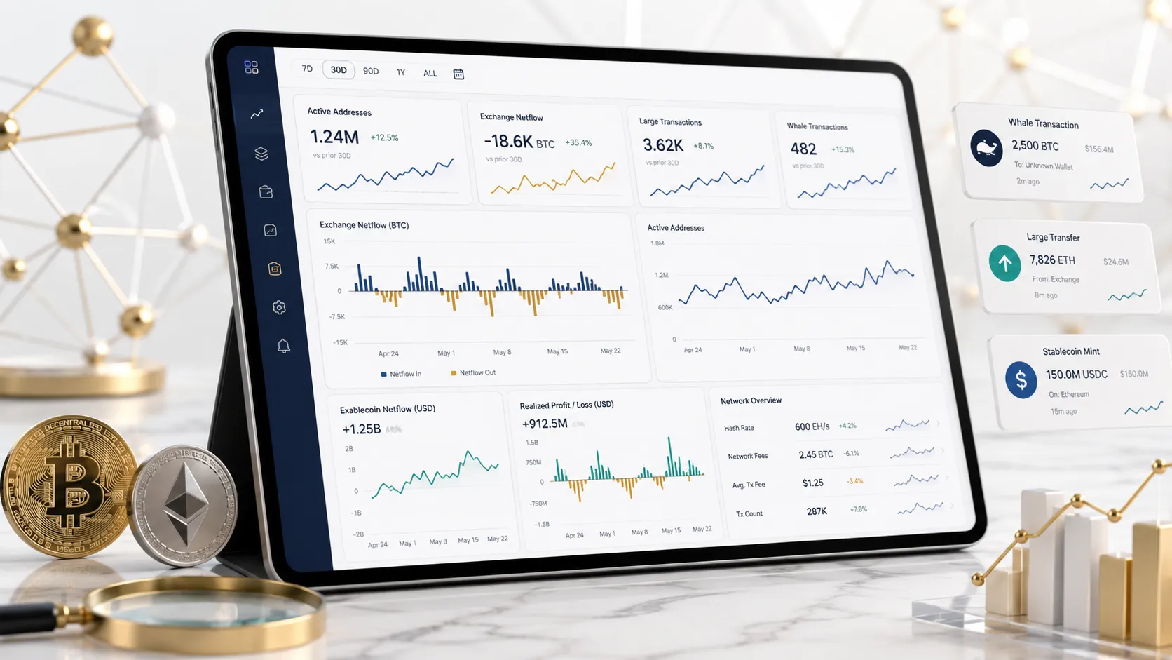
- On-chain analysis means reading blockchain's public ledger for market intelligence that goes beyond price and volume
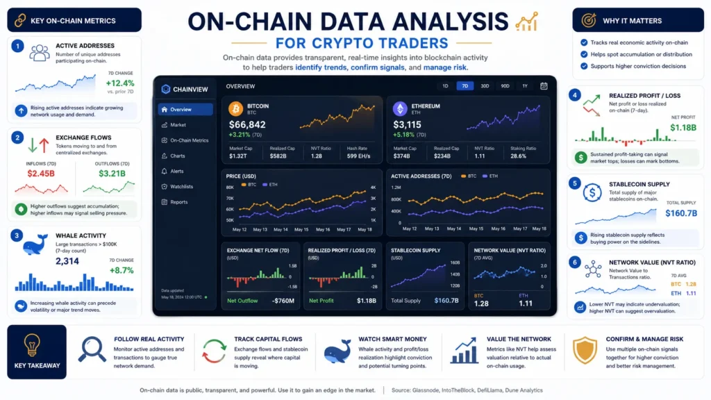
- Core metrics: MVRV, SOPR, exchange netflows, active addresses, whale movements, NUPL
- Bitcoin's MVRV Z-Score sat at approximately 1.32 in early 2026, well below the overheated zone above 7 seen at 2017 and 2021 peaks
- US spot Bitcoin ETFs held $134.2 billion in assets by early 2026; ETF flow data is now a required input alongside traditional on-chain metrics
- Top tools by use case: Glassnode for macro, CryptoQuant for exchange flows and short-term signals, Nansen for wallet intelligence, Dune for custom queries, Arkham for entity tracking
- On-chain works best for BTC and ETH; smaller assets have thinner data and less reliable signals
- Over 70% of institutional Bitcoin desks now incorporate on-chain metrics per Glassnode data
- Single metric signals are unreliable; requiring 3-4 aligned readings before acting is a commonly recommended discipline
- On-chain identifies macro zones, not exact prices or timing
On-chain data analysis reads the blockchain directly: every wallet, transaction, and flow is public and permanent. Price charts show what happened. On-chain shows who did it, where funds moved, and whether the move has real weight behind it. This guide covers the core metrics, tools, and workflow for using on-chain data to improve trade decisions.
What On-Chain Analysis Actually Does
Traditional markets hide the “why.” Crypto does not. Every BTC transfer, every exchange deposit, every smart contract call sits permanently on a public ledger. On-chain analysis extracts that raw data, processes it into metrics, and gives traders a second view that price charts cannot provide.
Where technical analysis shows price reacting to past behavior, on-chain shows current positioning: are long-term holders accumulating or distributing? Are coins moving onto exchanges, signaling sell pressure building, or leaving them, suggesting a potential supply squeeze? Is the market holding unrealized profits near historical tops?
The answer to those questions often precedes price action rather than following it.
The Core On-Chain Metrics
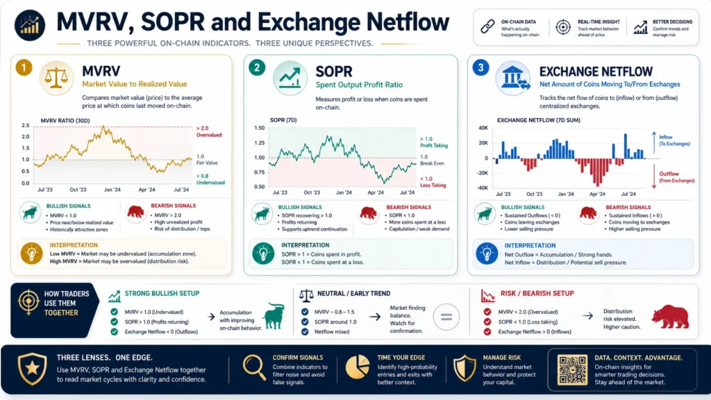
MVRV Ratio (Market Value to Realized Value)
The most widely cited valuation metric in on-chain analysis. It compares market cap, what the market says BTC is worth now, against realized cap, the sum of all coins priced at what each holder last paid.
Reading it: MVRV above 3.5-4.0 historically signals overheated conditions and cycle top risk. MVRV below 1.0 means the aggregate market is underwater, historically a strong accumulation zone. The MVRV Z-Score at approximately 1.32 in early 2026 placed BTC in fair value territory with room to run, well below the 7+ readings seen at 2017 and 2021 peaks.
SOPR (Spent Output Profit Ratio)
Measures whether coins moving on-chain are being spent at a gain or a loss. SOPR above 1.0 means sellers are profitable; below 1.0 means capitulation, selling at a loss.
In uptrends, dips that reset SOPR toward 1.0 often signal good re-entry zones. Sustained SOPR below 1.0 has historically marked genuine bear market capitulation.
Exchange Netflows
Tracks net movement of coins onto or off exchanges. Coins flowing onto exchanges signals sell pressure building. Coins flowing out suggests accumulation or self-custody, reducing liquid supply. This is one of the fastest-reacting short-term on-chain signals and a core metric on CryptoQuant.
Active Addresses
Counts unique addresses active as sender or receiver each day. Rising active addresses signals growing network usage. Falling active addresses during a price rally is a divergence warning that the move lacks broad participation.
NUPL (Net Unrealized Profit/Loss)
Measures the aggregate unrealized profit and loss of the entire market. NUPL above 0.75, the euphoria zone, has historically aligned with cycle tops. NUPL below 0, the capitulation zone, has historically aligned with generational buying opportunities. Use alongside MVRV for cycle positioning.
Whale Movements
Large wallet transfers, particularly deposits to exchanges, can precede significant sell pressure. Platforms like Nansen label over 500 million wallets, identifying funds, market makers, and smart money rather than showing only raw addresses.
| Metric | What It Measures | Signal Direction |
|---|---|---|
| MVRV | Market value vs. aggregate cost basis | High = overheated; low = undervalued |
| SOPR | Are coins moving at profit or loss? | Below 1.0 = capitulation; above 1.0 = profitable exits |
| Exchange netflows | Net coin movement onto/off exchanges | Inflows = sell pressure; outflows = accumulation |
| Active addresses | Network participation | Rising = genuine adoption; falling during rally = weak move |
| NUPL | Aggregate unrealized P&L | >0.75 = euphoria/top risk; <0 = capitulation |
| Whale movements | Large wallet deposit/withdrawal patterns | Exchange deposits from whales = potential sell pressure |
Advanced Metrics Worth Knowing
Puell Multiple compares daily miner issuance value to its 365-day moving average. High readings signal miner selling pressure; low readings signal suppressed issuance, historically a buy zone.
Binary CDD (Coin Days Destroyed) measures how many coin-days are destroyed in a given period, weighting long-dormant coins that suddenly move. Spikes indicate long-term holders distributing, often near tops.
Stablecoin flows: Rising stablecoin reserves on exchanges signal deployable capital waiting on the sidelines. Falling stablecoin reserves suggest capital has already rotated into volatile assets.
Funding rates: While technically a derivatives metric, funding rate data on CryptoQuant ties closely to on-chain conditions, revealing whether the market is overleveraged long or short, which affects how supply shocks play out.
TVL (Total Value Locked): DeFi-specific. Rising TVL signals genuine protocol adoption and capital commitment. Falling TVL signals capital flight. DeFiLlama is the primary aggregator, fully open-source and free.
The ETF Layer: What Changed in 2026
Spot Bitcoin ETF approval in January 2024 fundamentally altered how on-chain analysis must be interpreted. By early 2026, US spot Bitcoin ETFs held $134.2 billion in assets, with BlackRock’s IBIT alone capturing approximately 71% of positive daily flows.
This matters because ETF flows represent large institutional demand that does not appear directly on the Bitcoin blockchain itself, since custodians hold BTC through OTC channels outside typical exchange-based on-chain metrics. A traditional on-chain metric showing stable exchange reserves could be misleading if institutional demand via ETFs is simultaneously absorbing available supply.
Practical adjustment: Track Glassnode’s exchange reserve data and ETF daily flow data, available via CoinGlass or Farside Investors, in parallel. ETF outflows paired with rising exchange reserves is a notably bearish combination; ETF inflows paired with declining exchange reserves is notably bullish.
Tools by Use Case
| Tool | Best For | Free Tier? |
|---|---|---|
| Glassnode | Macro on-chain, cycle metrics, institutional-grade data | Limited (key metrics paywalled) |
| CryptoQuant | Exchange flows, short-term signals, miner data, derivatives | Yes, basic tier |
| Nansen | Wallet intelligence, smart money tracking, 500M+ labeled addresses | Limited |
| Dune Analytics | Custom SQL queries, DeFi/NFT/L2 tracking, 100+ chains | Yes |
| Arkham | Entity-level wallet tracking, visualized transaction flows | Yes |
| DeFiLlama | TVL, protocol fees, chain-level DeFi data | Yes, fully free |
| Santiment | On-chain plus social sentiment, whale movements | Limited |
| Token Terminal | Protocol revenue, fees, usage fundamentals | Yes, basic tier |
Starting point for most traders: CryptoQuant’s free tier for exchange flows combined with Glassnode’s free MVRV and SOPR charts, supplemented by DeFiLlama for any DeFi exposure. Add Nansen or Arkham when wallet-level intelligence becomes relevant to the specific trade thesis.
How to Build an On-Chain Workflow
Step 1: Macro context first. Check MVRV and NUPL weekly. Are you in a historically undervalued zone, fair value, or overheated territory? This frames whether the risk environment favors accumulation, holding, or reducing exposure.
Step 2: Supply pressure. Check exchange netflows daily or weekly depending on your timeframe. Sustained outflows plus declining exchange reserves signals a supply squeeze setting up. Sustained inflows signals distribution.
Step 3: Participant behavior. Check SOPR to understand whether current sellers are capitulating or taking profit. Capitulation SOPR during a price bounce is a stronger signal that a bottom is forming.
Step 4: ETF data. Check daily ETF flow direction alongside on-chain data. Divergences between ETF and on-chain signals require additional caution; alignment in both directions strengthens conviction.
Step 5: Confluence requirement. Require 3-4 aligned signals before taking major positioning decisions. Metrics can stay extreme for extended periods: MVRV was below 1.0 for five months in mid-2022 while price fell another 35%.
Step 6: Alerts, not obsession. Set threshold alerts on Glassnode or CryptoQuant for extreme readings rather than checking continuously. On-chain identifies macro zones, not intraday price targets.
What On-Chain Cannot Do
No exact prices or timing. Metrics identify high-probability zones and structural conditions, not precise tops or bottoms.
Works best on BTC and ETH. These networks have years of robust data, labeled entity databases, and thick enough liquidity for signals to be meaningful. Smaller assets have thinner on-chain data and are easier to manipulate.
Cycle dynamics shift. Patterns from 2017 or 2021 face different conditions in 2026, with spot ETFs, institutional treasuries, and nation-state holders creating demand channels not reflected in traditional on-chain frameworks. Weight recent cycle data more heavily than older historical averages.
Complements, not replaces. On-chain works best as the macro layer, setting broad context within which technical analysis, order flow, and fundamental research operate.
Who Should Prioritize On-Chain Analysis?
| Trader Profile | On-Chain Relevance |
|---|---|
| Long-term BTC/ETH holders, position traders | Very high. Cycle metrics directly inform accumulation and distribution zones |
| Swing traders (days to weeks) | High. Exchange flow and SOPR data inform short-to-medium term entries |
| DeFi and altcoin traders | Moderate to high. TVL and wallet flow apply; raw on-chain signals less reliable on smaller assets |
| Short-term scalpers and day traders | Lower. On-chain operates on macro timescales; funding rate data from derivatives is more applicable for short timeframes |
Our Take
On-chain data analysis gives crypto traders a third analytical layer beyond price charts and fundamentals: direct, transparent visibility into what blockchain participants are actually doing with their capital. Core metrics like MVRV, SOPR, and exchange netflows have demonstrated historically consistent alignment with cycle zones, and the 2026 institutional landscape has added ETF flow data as a required parallel input for complete analysis.
The edge is real but conditional. It requires confluence across multiple metrics rather than single-signal reactions, a recognition that cycle dynamics evolve with market structure, and an honest understanding that on-chain identifies broad macro zones rather than precise price targets. Used as the foundational macro layer within a broader analysis framework, it consistently improves decision quality for traders operating on timeframes longer than a few hours.
This article is for informational and educational purposes only and does not constitute financial or investment advice. Cryptocurrency trading carries significant risk of loss. Always conduct your own research and consult a qualified financial advisor before making investment decisions.
Frequently Asked Questions
